What colors to wear for family photos.
Choosing what to wear for a family photo session can feel overwhelming believe me, I get it.
“Can you give us some tips on what to wear?” is one of the most common questions that I get asked.
not to worry, I’m going to let you in on some tried and true tips.
Here are some pointers on what looks good in photos and what to stay away from. Of course this is my personal opinion and what I have learned from photographing hundreds of families.
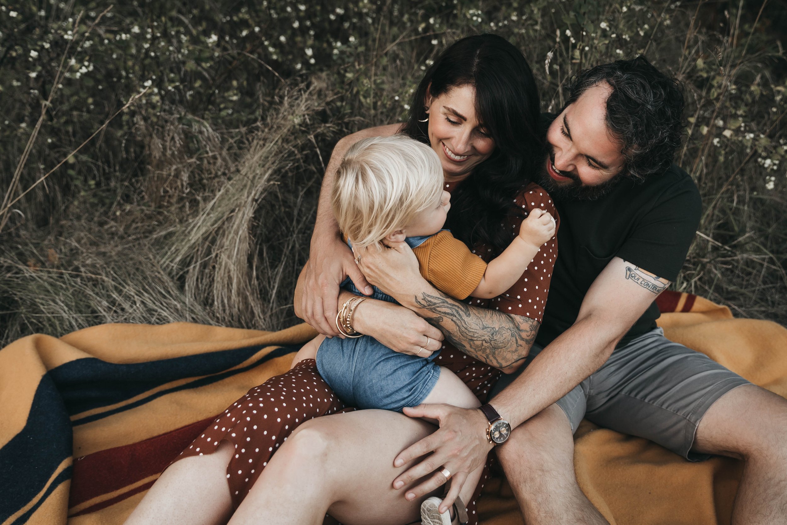
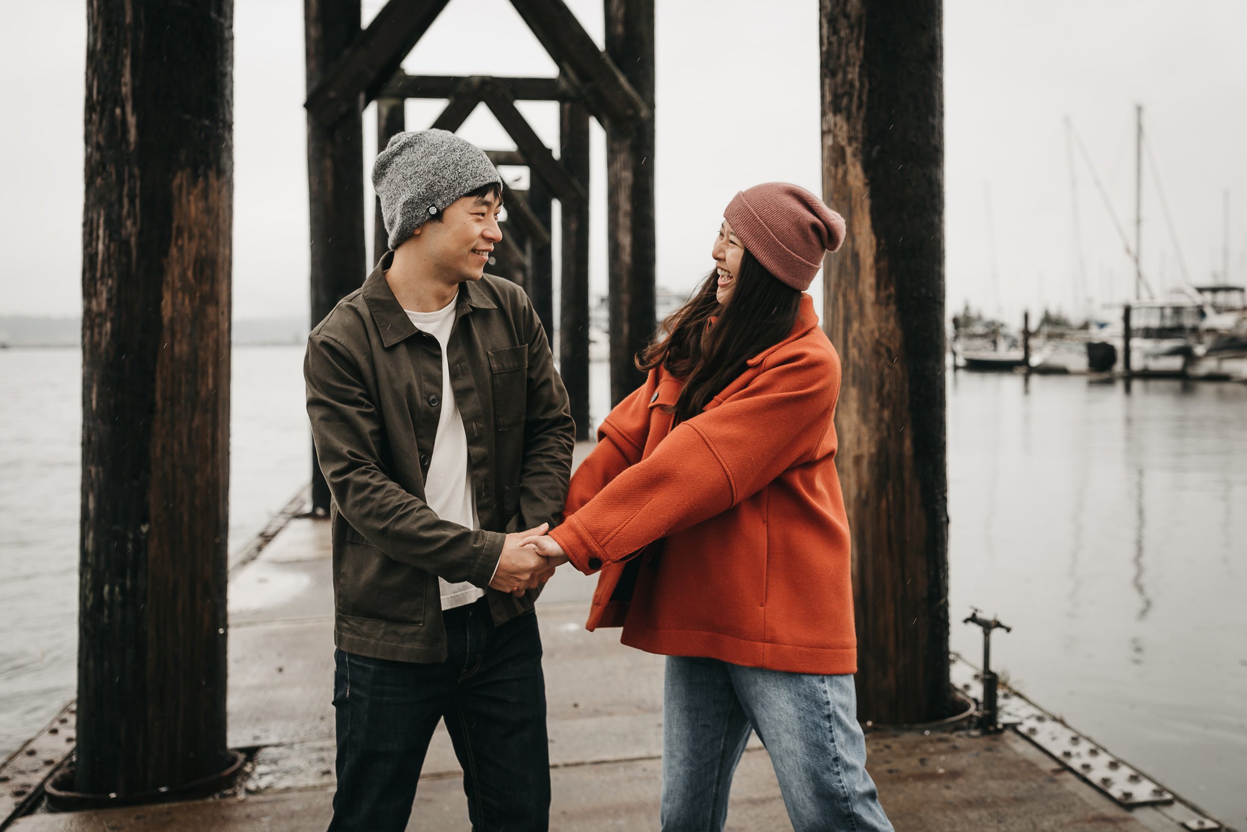
~All the images below are examples of what you should wear~

Earth tone look great, they just do. they photograph well.
The colors are neutral.
2. They compliment the PNW locations.
3. They all look good together, so they’re easy to coordinate.
4. They add warmth to a photo without taking away the attention from the people.

Layering, Layering, Layering.
I love the look of layering in a photo.
It allows movement and interest, depth and texture, which are all GOOD things.
It also allows you to introduce a new color, or simple pattern and of course, keep you warm.
you can easily remove the layer to change up the look.

Choose a pop of color. But keep the color soft.
I think it’s great to have a little pop of color. But here are some things you’ll want to keep in mind when choosing the color.
Pick a color that compliments the color palate that you are working with. You want it to add to the photo not take all the attention.
Colors to stay away from-
Neons- They draw all the attention in the photo.
Bright Red- It can be a hard color to photograph and it also can cast onto the skin. Choose a burgandy instead.
Black- A little bit is fine, but a whole shirt can dull the image. Use it paired with a layer is a better option. Jeans are fine.
Bright White- It often looks blue in photos. It’s tricky to edit and can also cast onto the skin making the person look washed out. Cream or taupe is a much better option.
Bright Blue- Once again, It will draw the attention. Choose a softer muted blue instead.

If you are going for a pattern, coordinate the other people in solid colors.
A pattern adds interest, but you don’t want it steeling the show or competing with another pattern.
Don’t do a small check or stripe. It causes weird movement in a photo.
Remember you want the focus to be on the faces, not the article of clothing.

Don’t forget the blanket. The blanket? Yup, one more thing to consider.
I will most certainly be asking you to sit because I love sitting shots. And I promise you, the blanket will show in the pictures. Choose something that compliments what your wearing. You can pick some thing fun like a Mexican blanket or a pattern of some sort. Just make sure that it doesn’t compete with your clothes. If you’re uncertain, you can never go wrong with a gray or beige. Choose one that you can throw in the wash. Depending on the season, chances are it might get dirty.
If you are going for a softer color palette.
Keep all the colors soft. Go for neutrals. Neutrals are things like off-white, gray, cream, taupe and so on. Keeping the colors soft and neutral lets the focus shift to the faces. Adding a gentle pop of color is great too.

Dress for the weather but keep your color choices in mind.
If it’s cold out, dress accordingly!
There’s no harm in embrassing the cold by throwing on a jacket and hat. Being warm is an important part of a succesfull photo session, especially for the kids! Plus jackets and hats done right, look great!
Don’t pick puffy coats or vests for children. They just add bulk and will block thier faces as they sit.
and don’t forget while making your choices for our shoot-Dress for play.
I promise you there will be playing, lots and lots of playing.

